Methods: predicting blood sugar spikes from personal diet
1. DATASET
The dataset consists of continuous blood sugar levels and detailed time-stamped diet logs for one pre-diabetic individual. There is also data available for several individuals and other health related factors, but I could not get access to use this data in time to submit this project. Before preprocessing, the there was two months of data consisting of 14,373 blood sugar measurements taken every five minutes and 168 diet/food entries. Note that that these numbers represent the data after removing travel days to avoid discrepancies between time zones.
2. DATA PREPROCESSING
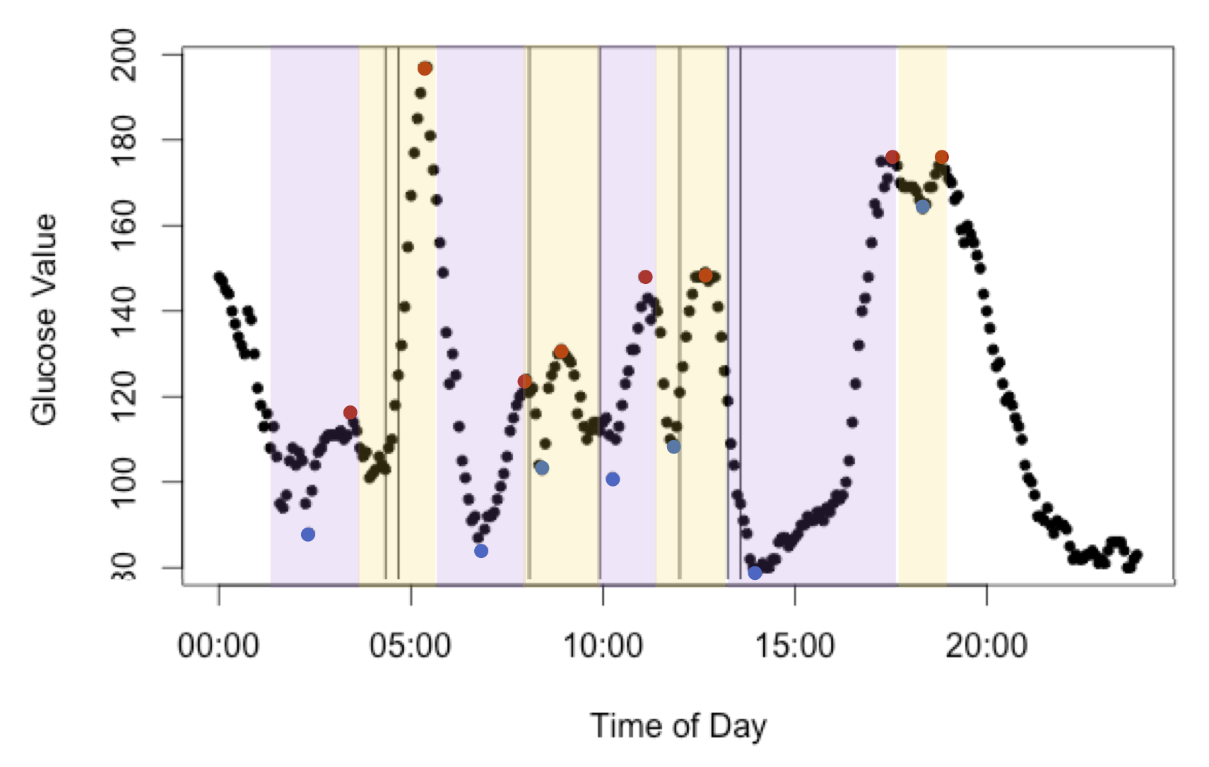
In order to properly relate the two datasets, the blood sugar measurements were compressed into minimum and maximum blood sugar levels, with maximum values hereby referred to as “spikes.” Windows were created starting from thirty minutes before a blood sugar level minimum until a spike, assuming that only events in this time window affected the spike. From this only windows that contained dietary log information were used to build models. This outcome variable was chosen because the height of the spike appeared to be both normally distributed and independent. See Figure 1 one the next for a pictorial representation. After processing, there were 69 glucose spikes with dietary information.
Click on this link to see my analysis
3. FEATURE SELECTION
The diet logs contain 19 primary attributes relating to nutritional content and food identity. Of these features, many had missing information (e.g. vitamin B is not recorded for all food) or were not thought to contribute to blood sugar levels (e.g. total fat) and so were not included. The remaining variables included calories, carbohydrates, sugar, fiber, food group, and food subtype. There were seven groups and one hundred subtypes recorded in the diet log, some of which were rarely recorded and others not thought to be be involved in blood sugar levels. Since limited observations are available, only the presence of most common groups/subtypes known to influence blood sugar were used as attributes: wine, banana, inulin (fiber), grain, and fruit.
Many of the features selected from the log were correlated, such as sugar, fiber, and carbohydrates. In order to reduce correlated predictors, glycemic index was used to encompass all three variables (glycemic index = carbohydrates – fiber – sugar alcohols). Since there is some dispute over whether carbohydrate load or glycemic index is most predictive of blood sugar levels, both were were included in the models. Additionally, given the interplay of fiber and glucose in blood sugar levels, eating a diversity of food may play a role in blood sugar levels and diversity of the diet was included in the model (number of food groups per window)
Timing of meals has been reported to affect blood sugar spikes and so several predictors were added to model this phenomenon. Time of day (coded as morning vs not) was included in the model since the subject recorded noticing correlation in blood sugar spikes and mornings. Finally, time since the last meal was included to represent consistency of meal times.
Click on this link to see my analysis
4. DATA TRANSFORMATION
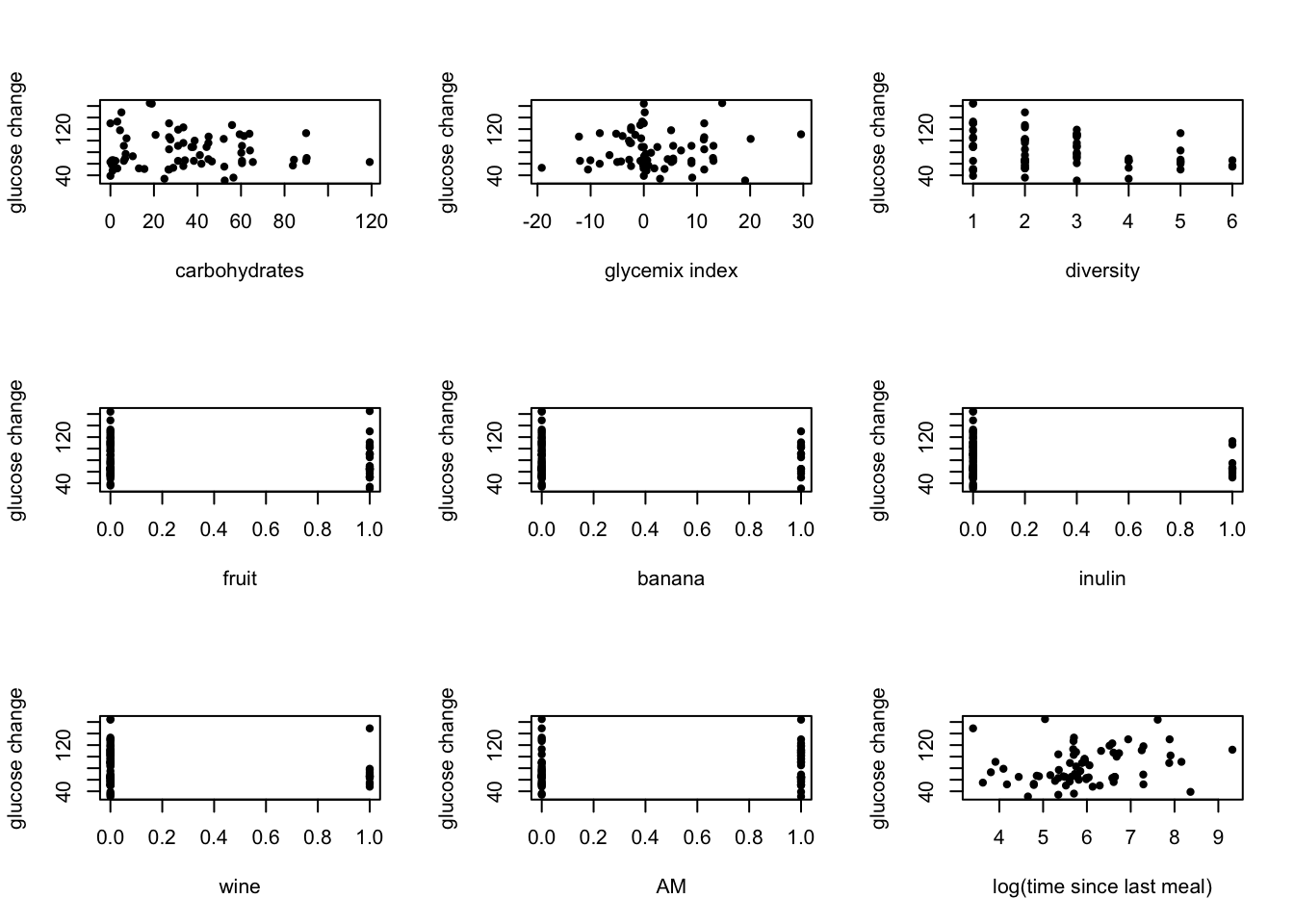
No additional transformations were applied to the predictors, with the exception of the transformations described previously. Many transformations were attempted (log, exponentials, factors), but the best relationships appeared to be linear as shown. The relationships appeared weak, but appeared significant enough to include all predictors in the models.
5. DATA MINING
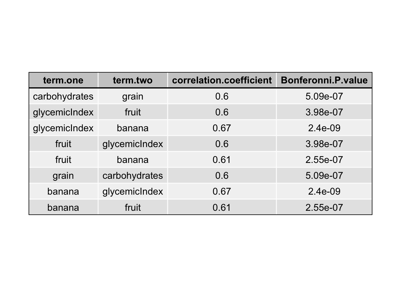
Prior to building models, the predictors were checked for interactions through graphing and assessing the significance of each interaction using a bonferroni corrected Pearson correlation test (Table 1). All of the predictors showed some significant interaction with another predictor, however, many of these correlation values were week. Only significant interactions with correlation coefficients greater than 0.5 were used in the models.
Click on this link to see my analysis
5.1 LINEAR REGRESSION
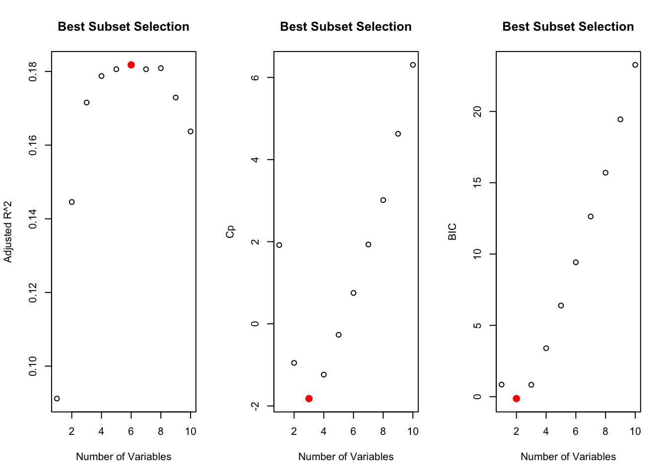
The linear relationship between the predictors and the outcome suggested that a simple linear model may best fit the data. Before fitting a linear regression model, best subset selection was performed since the number of predictors, including interactions, was more than 10% of the observations. The regsubsets() function from the “leaps” package in R was used to select the best subset predictors using the Cp estimate of MSE on the entire dataset (Figure 3). The selected predictors were then used to calculate the linear regression model using the lm() package provided by R.
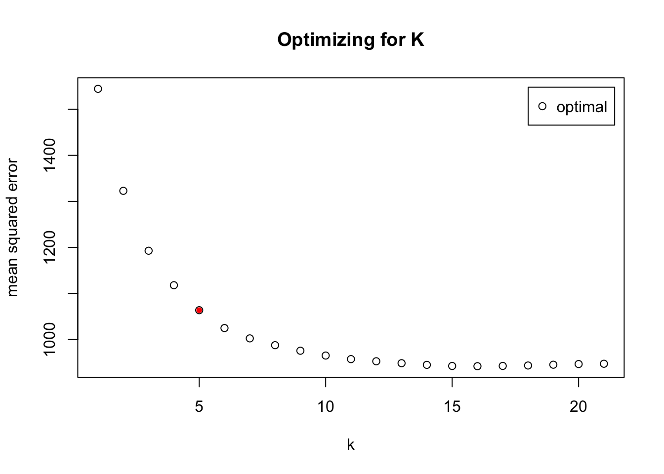
5.2 K-NEAREST NEIGHBOR
In order to determine test a model with more flexibility than linear regression, k-nearest neighbor was first attempted to fit the data. The number of clusters for the model was chosen using the function train.kknn() from the R package “kknn,” selecting up to 21 clusters with an “optimal” kernel for the search. For the entire dataset, the mean squared error started to plateau around 11 clusters (Figure 4). Thus, a k-nearest neighbor model with k = 11 was built using the function kknn() from the same package. This model included all of the predictors and all significant interactions described above (see DATA MINING), but forward selection will be used in the future to determine which predictors to include in the model
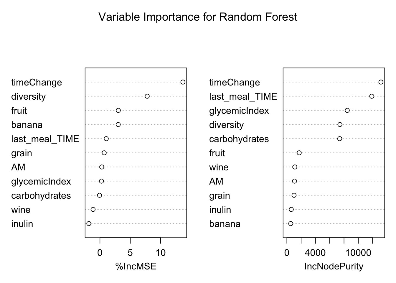
5.3 RANDOM FOREST
Random forest were chosen as the third model in order to try a tree-based model for fitting the data. The randomForest() function from the R package “randomForest” was used to build the model. This function performs out-of-bag validation to select predictors for the model and so all predictors and interactions described above (see DATA MINING) were included.
5.4 BOOSTED REGRESSION
Boosted regression was used to attempt to build a more robust model from the weak predictors in the dataset. The function gbm() from the R package “gmb” was used to generate the model. The value of lambda was optimized to reduce the mean square error and found to be 0. Values of lambda from 0 to 2 (at intervals of 0.001) were tested on a random quarter of the data, using the remaining 75% to train the data. The number of trees was set at 5000 and the interaction depth to 4 to start the performance of the model very high (note that these values were not optimized, but will be in the future). Forward selection could also have been used to select the features used in this model; however, all features and interactions described were used in this model.
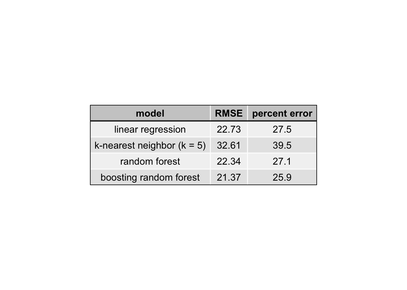
6. INTERPRETATION AND EVALUATION
After tuning the parameters and selecting the variables as described above, each of the models was tested to determine performance as measured by the root mean squared error (RMSE). The RMSE was calculated with leave-one-out cross-validation. More specifically, each model was trained on (n-1) observations and the RMSE was calculated for the remaining observation. This was repeated for every observation and the average of the RMSE is reported in Table 2 below.
This R Markdown site was created with workflowr